Take a sad song and make it better.
We may not style hair or refurbish homes, but here at FetchRev, we like to think of ourselves as part of the makeover industry. Our most rewarding projects are ones where we transform underperforming campaigns into money-making landing pages, with a few optimization tweaks—and a bit of creative secret sauce.
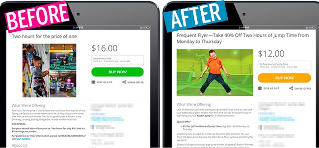
Recently, a family entertainment franchise client approached us with a request to give a little campaign rehabilitation to an old deal for a new location. The before-and-after screenshots are striking, but the results speak for themselves. Our revamped offer netted $720 in revenue over a week, and a strong 8.0% purchase rate. Here’s what we did to upgrade our client and set them up for success.
Imagery
An ideal landing page image fills the allotted area entirely, features a palette that is complementary to brand colors, and simply helps to communicate the marketing message. In this case, the “before” image was a complex collage that was improperly sized (we recommend 650 by 400 pixels) to fill the white space. It also featured a rock wall, dodgeball, and karting—three attractions that weren’t part of the deal being offered. We re-worked the image to incorporate the business’s signature lime green, superimposing a singular child jumper to keep the messaging simple. The new image is attention-grabbing, yet doesn’t compete with the offer.
Headline Copy
Our attention spans are notoriously short, and the headline may be the only few words a customer will read, so to be effective, it should be clear, concise, and intriguing—all in a few words’ work. Our client’s original headline (“two hours for the price of one”) was straightforward, but fell flat in expressing the excitement of a trampoline park offer. With a little wordsmithing, we gave this crucial line of copy a bit of whimsy, all the necessary specifics, and a distinct call to action (“Frequent Flyer—Take 40% Off Two Hours of Jump Time from Monday to Thursday). This way, if we lost a customer’s attention somewhere through the body copy, they’d have enough information frontloaded at the top of the landing page to make the decision to purchase.
Body Copy & Formatting
Our final overhaul came in the body of the landing page where we recreated the opening grabber to guide the consumer on a clear path to purchase. The amount of copy was significantly reduced, and at the same time, the impact of each word increased. We created a stronger sense of urgency and injected fun wordplay to delight customers as they read on to the offer itself. When it came to the actual deal, we simplified the presentation of the savings, so that there would be no question as to exactly how good of a deal this was.
Assignments like this are what get us out of bed in the mornings, and we were thrilled that the outcome of this campaign was a tribute to the strategy and execution behind our work. To get your next campaign rolling, please contact your FetchRev marketing specialist.
Devin Pangaro
Vanessa Demske
FetchRev Digital Content Team